Showing posts with label Fashion. Show all posts

12 April 2012

Why You Should Care About Clothes


Clothes are important. They say something about you. No matter how unfair it feels, people will make judgments about you based on your appearance. I wish we lived in a world where we could publicly and daily wear pajamas, booty shorts, ball gowns, or Snuggies without any personal judgment or consequences (good or bad). But it is not the world we live in, and there is no Utopia in sight. Judgment based on what we wear is a fact of life, and it always has been since the practice of wearing clothing began. I'm sure we've all seen or heard about or seen the sites that post pictures taken at Wal-Mart for the purpose of laughing at what clothes people wear. And I'm 99.9% sure when any us of see those Wal-Mart photos we don't then say, "Oh, but I'm sure they are a nice/good/valuable person." Nope, those photos bring up negative judgments about those people, their jobs, and their lifestyles.

Many people futilely rage against the fashion machinefutile because they still must make choices about what they wear, and these decisions will bring judgment and consequences (good or bad) with them. Sure, part of it is social conditioning, but I also believe we are predisposed to group ourselves by likeness or unlikeness because we want to feel accepted, at ease, and safe, and clothing plays a part in that. We group ourselves by language choices (think especially of the slang you use and work jargon), interests, politics, lifestyle, religion, and team affiliation, and we group ourselves by what we wear. We can even "code-switch" these group identifierschanging our jargon, topic choice, or what we wear—to better fit into different groups as we move among them, and there's absolutely nothing wrong with that. It is natural that I make different speech choices with my friends than I do with my grandma, and that I wear different types of clothes to work than I do going to a movie with friends, because these things immediately mark me as belonging to different communities that all contribute to who I am. (Also my grandma wouldn't understand me if I pwnd her like a n00b.)

But our clothing choices (not to mention other grooming and cleanliness choices) not only place us within general groups or communities, but they identify us in other ways. We make clothing choices to make an impression (good or bad), to make a statement (even if that statement is "I don't care"), to comment on our socioeconomic status, to comment on how "hip" we are, to display our creativity, to get attention (good or bad), to attract, to repel, to show respect, and to show disrespect. As an obvious but effective example: Showing up to a desk job interview in jeans and a t-shirt says, "I don't care if I get this job and I don't respect your company's chosen image, or the interviewer for participating in the company's image." It won't matter how qualified you are, you're not getting that job. Well, unless you're in a movie or are some sort of mega genius who has trouble with social cues. Conversely, showing up to your first Hell's Angels meeting in a tweed jacket and bow tie will likely deny you acceptance in that group, and it may be dangerous to your health.

Relevant story time: I have a friend who is a dentist. He's a very easy going man who loves his chinos, jeans, T-shirts, and Converse, and he wore said clothing to work. His wife kept telling him he needed to dress up, at least a little, when he saw patients, but for years he didn't. He felt that this one aspect of who he was good enough. Then one day he realized that the way he dressed was affecting the way his patients perceived him. It affected how his patients respected his education and authority as a dentist, meaning that some patients doubted his effectiveness and ability in doing his job, or they doubted whether he took his education or job seriously. This was not a good for repeat business, and he definitely wants repeat business.

Dentist friend made the mistake of thinking that there is only one way to dress in order to be himself. But even though he is easy going, he's also a dedicated and competent dentist. By dressing in a way that immediately conveyed his dedication and competency in immediately understandable ways, he wasn't abandoning who he was, he was simply showing a different part of who he was. (There are ways that you can show different parts of who you are through the gamete of formality, it's called style, but it's another topic for another time.)

The point is that your clothing decisions, whether fair or not, say something about you. And people will judge and treat you accordingly. So you can either sulk about it and wear your cargo shorts everywhere and exclaim "why don't people just accept me for who I am? My shorts don't affect my ability to negotiate contracts/program this computer/ride my hog/support you at your wedding." Or you can think about what you're saying with your clothes and control it to your purpose and benefit.

08 March 2012

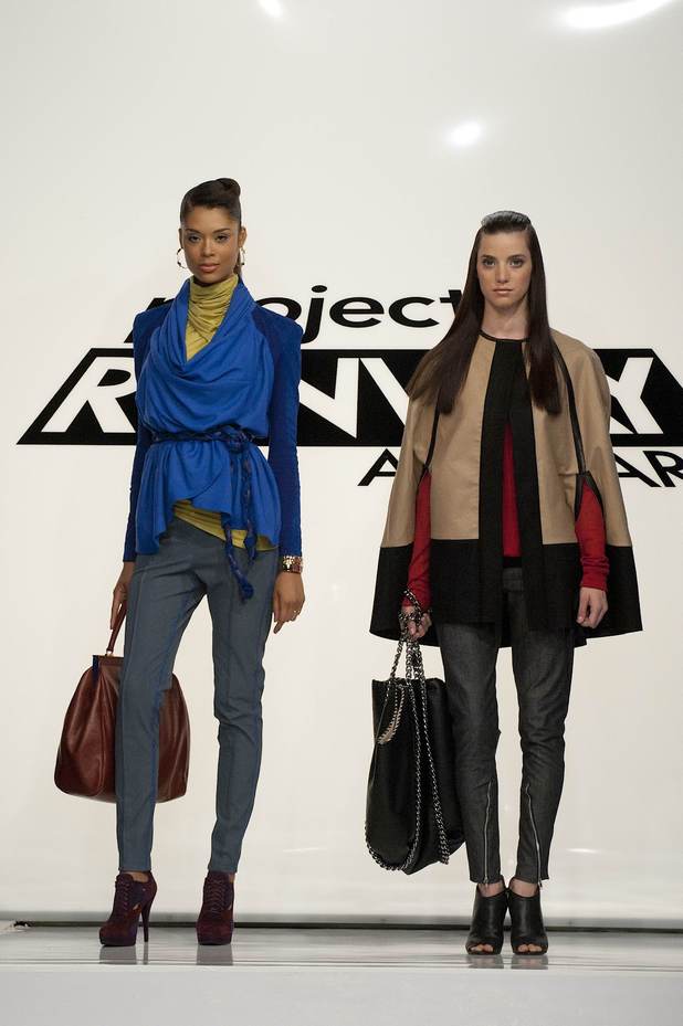
Project Runway All Stars: Pre-Finale

Here we are again, the episode that decides which designers will be in the finale. I thought it an interesting challenge for the finale setup. Meaning, the previous challenges were all about pushing creativity to the far nether regions of fashion that often negated practicability, but this challenge was about setting parameters on creativity in order to make aesthetic and point of view sellable. A challenge that gives the designers a real marketable budget really forces the designers to get down to the brass tacks of their aesthetics. It's the reality behind the runway, not unlike taking the photoshop element out of a glossy magazine spread. Of course this makes the runway seem less punchy than in past weeks, so nothing was a gasp-wow.

The designers were required to make a ready-to-wear garment for New York designer and fashion district advocate Nanette LePore. Not only did she ask for the design to be feminine, timeless, and customer driven, but the designers also had to account for manufacturing costs and stay within a strict production budget in order to meet a specific price point. The winner will have their garment produced and sold by Nanette LePore with proceeds going to savethegarmentcenter.org.

First, the "Mondo doesn't sketch" drama. In most challenges this is not a problem, and in this case I think he worked around the problem okay. But I both agree and disagree with Kenley (and it's none of her business in the first place) that Mondo needs to sketch in order to be a designer. On one hand sketches smooth the path of translating ideas into realities in a world where Mondo isn't creating everything from start to finish. But if he figures out another way to communicate his ideas clearly to a pattern maker, then yippie-yay-ki-yay. On the other hand I think he would better service himself as a designer if he at least learned to sketch in some way, even if he traces over croquis. (Croquis: a line drawing of a 9-head fashion figure that can look something like this.) I'm not sure if this practice is against the Project Runway rules, but it a perfectly legitimate way in fashion and costuming to produce sketches. I'm sure some look down on this and shame it, but it's not about the sketch, it's about the final product.

Despite Mondo's seeming un-designerly attributes, he won the challenge. I will admit that his reaction to winning made me a little misty. (But that's not saying much because I am an acute bawl-baby.) His dress really screamed what Mondo is all about: color and mixing patterns within clean lines. Would I wear this dress? No. Do I really like it? Yes. Will other people buy this dress? You betcha. You can buy it here. I'm excited to see what he comes up with for the finale!

Austin was second in line, and he also produced a dress that screams what he's all about: romantic silhouettes with extreme femininity, which likely includes loads of volume. I was torn with Austin. I thought the overall silhouette of the swing coat was great. The fullness and amount of pleats were in good proportion. However, the neckline looked like a mistake, and I was absolutely horrified by the hem. The stitching pulled the hem in weird ways and it needed to be pressed so badly, as did the belt and the rest of the coat. (Here's a little tip for all you burgeoning sewers out there: pressing accounts for at least 50% of the final appearance of your garment. The more you press as you go, the more professionally finished your garment will look.) All Austin's problems may have stemed from poor fabric choice. Also, the garment did not photograph well in the least.

Michael came in third with a dress that we've seen from him before, but it was pretty enough. I thought the print was particularly lovely. But if a dress plunges in the front it should not plunge in the back and visa-versa. Without that counterbalance it's impossible to keep the dress on the shoulders unless you use tape or body glue. It fails all wearability tests, and wearability was part of the challenge. For this reason Michael was particularly lucky that he didn't go home.

Last and eliminated was Kenley. This dress bothered me for all the reasons various people mentioned and more. I suppose it was nice enough in idea, but I had the following problems: 1) she shouldn't have used that large print for this silhouette, the design fights with the fabric; 2) she should have at least tried to match the pattern and/or place the pattern more carefully when cutting; 3) the trim on the sleeves ruined the inherent movement of the fabric; 4) the neckline was too high which killed the proportions; 5) she should have kept the keyhole; and 6) all things said and done this dress is frumpy. Additionally I could not believe the attitude she gave Nanette LePore during the workroom critique. She can't even listen to critique let alone internalize any advice that might help her improve her designs or sellability. She kept saying she was "sticking to her vision," but no one was ever trying to change her vision, they were honestly trying to help her make the best possible version of her vision. P.S. The outfit that Kelney wore for judging was adorable.

One more week and then what fashions will we discuss? Leave ideas in the comments if you got 'em.

27 February 2012

Red Carpet Review: Oscars 2012

I would like to create a new pre-Oscars red carpet show. Picture this: a producer off camera would ask a celebrity who they are wearing; someone would type this information into a computer; the celebrity  stands and poses for a moment so two cameras could film the front and back of the dress/tuxedo; the designer information would appear on the screen simultaneously; everyone could see the fashions and no one would have to hear a "personality" ask inane questions that elicit equally inane answers. We could see so many more fashions in so little time and it would be great. (Rant complete.)

If I talked about all the fashions I wanted to, this post would get crazy long, so here's a synopsis of what I saw on the red carpet.

Trends!
There were several dresses in a buff to ever-so-slightly pink neutral color walking down the red carpet as well as several all-over sequin gowns. There were also several dresses in shades of blue and a few in shades of red.


Best!
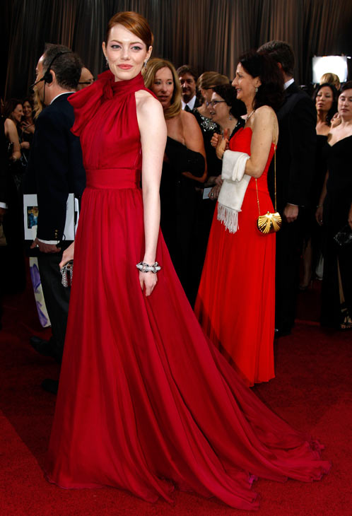
Emma Stone looked fantastic in Giambattista Valli. Beautiful in color, fabric, and simple silhouette. Not everyone could pull off a giant puffy bow at the neckline, but Ms. Stone wore it gracefully.

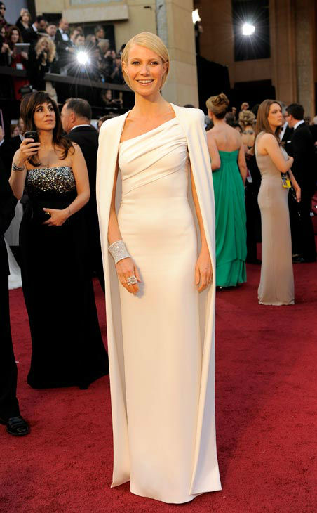
I can't believe I'm saying this, but I loved Gwenyth Paltrow's all white look by Tom Ford. At first I was leery of the cape, but there really was something regal and polished about it. Without the cape, the dress was simple, flattering, and stunning. It was too bad her hair looked terrible.

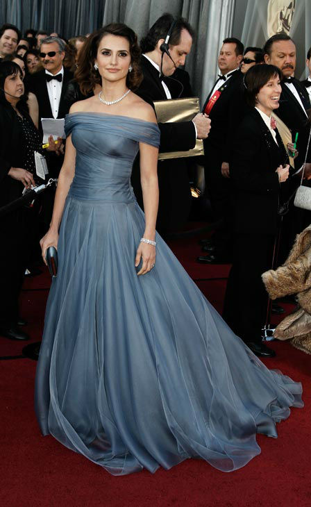
The fabric was the star of Penelope Cruz's Armani Prive gown; it moved so elegantly. Plus the slate color popped nicely on the red carpet. I wasn't crazy about her hair, there was something a little off, but overall she looked stunning.

Worst! 
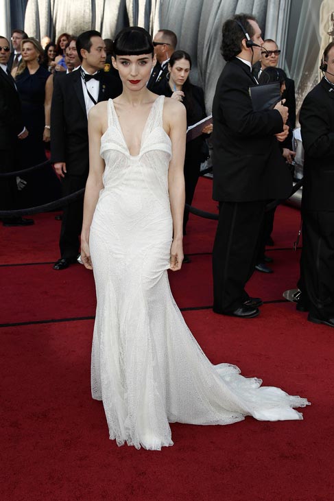
Rooney Mara's Givenchy dress was a sad and droopy. The flanges on the bust frankly made her breasts look long, which throws the proportions of the silhouette. However, I though her styling was fantastic. Her delicate features, fair skin, red lipstick, and severe hair makes her look like a 60s French ballerina.

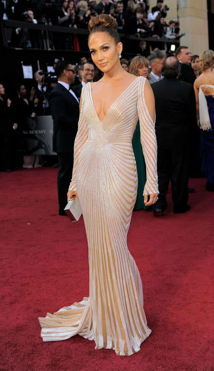
Jennifer Lopez's dress was just...odd. I didn't understand it. The sleeve cutouts and junior-high-student-length sleeves gave a trashy feeling to the dress.

Colin Firth's wife, Liria Giuggioli, looked matronly in her modernized crumb-catcher bodice. It had the same effect as Mara Rooney's dresses, making this beautiful Italian woman look droopy and ill proportioned on top.

Man Trend!
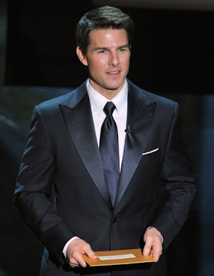
A lot of men were wearing a larger, almost 70s butterfly bow tie (as seen above on Colin Firth), but I don't think anyone went over-the-top with it. There were also a nice number of white, peek-a-boo pocket squares, but I think Tom Cruise might have done it best.

Worth Mentioning!
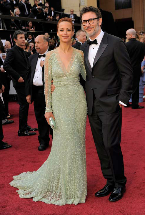
Berenice Bejo in sea foam sequins.

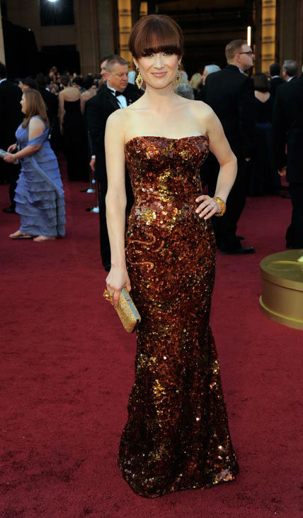
Ellie Kemper in bronze sequins.

Nina Garcia with a modernized stomacher.

Stay tunned for my Oscars highlights post.

24 February 2012

Project Runway: All Stars: Flags of the United Nations

I have decided that I do not like Angela as a host. There's nothing terribly offensive about her, but she's so unnatural on screen. Instead of projecting with normal intonation, she starts speaking in a loud monotone and it grates on my nerves. Petty? Maybe. But if you're talking a lot on TV, your voice should not be hard on the ears.

Moving on.

Is it just me or were the designs this challenge uninspired and drear? It seems to me that one would be steeped in inspiration when considering not only a country's flag, but its history and culture as well. In fairness, with a time-crunch it would be easy to fall into the trap of cliché and stereotypes. (I'm looking at you Jerell and Michael.) But the fact remains that not one of the designs made me sit up and say "boy-howdy"!

Mondo's was the best this week with his Jamaican flag inspiration, so his win was deserved. (At the moment I can't think of a harder dress to wear, but when has runway fashion ever been about wearability?) I disagreed with Isaac's opinion that the geometric strap down the back "ruined" the dress by being too literal. If Mondo had presented this dress outside of the flag inspiration, I don't think that would have been an issue at all. If anything "ruined" the dress, it was the styling. It's time for me to admit to the hard fact that although Mondo is a great designer, he can't style worth beans. His clothes speak volumes so he doesn't need heavy styling, and I wish someone could pull him aside and explain that to him. (Side note: Mondo's own hair was so fantastic this episode.)


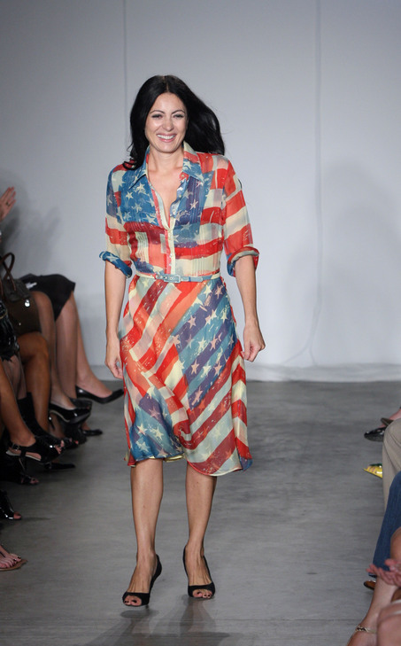
As a point of interest I looked up guest judge Catherine Maladrino's American flag dress, and what is it if not literal with a pretty flowing fabric and a nice cut? (Apparently celebrities and socialites wore it to express patriotism after 9/11, but I don't recall seeing it before now.)

I didn't hate Kenley's Chilean flag dress, I just didn't see what it had to do with the challenge. Sure, she used the colors in the flag, but I didn't and don't get "Chile" from that dress. She gave some explanation about current street-style in Chile (which I'm sure she hasn't researched), but I think it was mostly a cover story for her penchant for sameness in her designs. I was happy that Isaac called her out on that issue. Let me be clear, I don't think Kenley is a terrible designer, but an obnoxious one whose inspiration is so narrow that it ends up doing her a disservice.


Michael rounded out the top three with his Greece flag dress. Everything that the judges said about this dress was true. It was too low and wide in the back opening, it was borderline pageant, and it had too much fullness in the draping. However, it was a nice enough dress. The white sequined trim was gorgeous.


I was shocked Jerell didn't go home with his mess of an Indian flag dress. The judges thought he had some good but unrefined ideas in the jumble, but I didn't see it. Anything he did have going for him was nulled by that overly blousy, green sari sash. There was nothing flattering about it. That green shade was a little sad and dusty for India as well. 


Austin, oh Austin. I like him so much, but the more I'm exposed to his aesthetic and designs, the less talented I think he is. Not only did his dress look tortured and overwrought, but the color palette was too dusty for his Seychelles flag inspiration. His styling is really always about the old lady look. In the end I thought his design looked more inspired by the grecian urn scene in The Music Man.


Mila went home this week with her Papua New Guinea design. She kept referencing "freedom" in the episode, but freedom certainly didn't come across in her finished design. Jerell was right saying that the dress looked more inspired by communism, especially when you consider the styling. Mila suffers the same malady is Kenley, meaning that Mila's narrow focus on color blocking and geometrics often does her a disservice. I will say this, Mila's construction skills are fantastic. Her garment looked sharp and polished as far as construction goes.


Favorite quotes:
"This isn't 'Greased Lightning,' this is more Greece frightening." Mondo about Michael's dress.

"I could feel his suffering in the workroom." Georgina Chapman talking about how tortured Austin's dress looked.


17 February 2012

Project Runway: All Stars: Broadway


I was engrossed in this week's episode. Not only do I have training in fashion design, but I also worked as a stitcher in a costume shop for three years to help put myself through a second round of college. I didn't design anything for the shop, that was reserved for students in the costume design program, but I did learn a lot about how clothes and fabrics work for the stage. So my creative mind was all abuzz during this episode.

Even though I've never seen Godspell, the criteria that was set out for the costume, based on staging and character, was quite clear. Since the character was being dressed on stage, separates were a must. The character was described as a wealthy and ostentatious woman who literally takes the clothes off of the backs of the poor to enhance and enrich and flaunt her wealth and appearance. This tells me that layers are also a must, and the the look should be eccentric. (It made me think of this incredible preview for an upcoming documentary.)

And who's better at eccentric than Mondo, this week's winner! The second his model stepped out on the runway my brain said, "That is stage-ready." I loved it. You can tell from the costume that the character is dark, eccentric, and concerned about their appearance. There's also plenty of shiny bits of fabric and jewelry to convey ostentatious wealth. I particularly liked the ties that trailed behind the model as she walked. For some reason those were the icing on the cake of the costume for me. Plus Mondo's styling, which has been off the past few challenges, is spot on.

Austin's design was also completely appropriate for the challenge. I adore that brocade he used. (I thought it would have looked great as a corset for this challenge.) His design also looks as though it came from different sources, but it all works together, which is exactly what was prescribed for the character. It could have used more glittery additions. A legging with a wee bit of sparkle and a few rhinestones sprinkled through the fur would and a richness that would read well from stage. (I'm not a shiny, glitzy person, but it really can change a costume to a wow on the stage.)

Michael rounded out the top three. While his design was good, it was more appropriate for regular fashion and not for this challenge. Costumes often push boundaries that don't really fly in everyday fashion; bold strokes are needed to make ideas read from the stage. I love the idea of that skirt and the fabric in the top is glorious.

Mila's outfit was horrific. The proportions were completely wrong and the model looked bulky on top and skimpy on the bottom. Sutton Foster (Thoroughly Modern Millie, Little Women) had it right when she suggested Mila's model looked like a prostitute. I didn't understand any of the design, from the fabric choice to silhouette choice.


Kenley's outfit looked so cheap, from fabric to design. The judged oohed over the cut of the jacket, but it was nothing special. The outfit looks like a little girl playing dress-up rather than a woman who flaunts her ill-gotten wealth. It looks like student work.

Kara went home this week. The thing is, I think her ideas were in the right place, but they were a) not executed properly; and b) did not push far enough. I thought it was a great idea to have lots and lots of pieces that the character keeps stacking on her body, kind of like a bag lady with access to couture fashion. But none of the fabrics looked rich enough and Kara should have pushed each piece of the design to be more grandiose and flashy.

11 February 2012

Project Runway: Fashion Face Off

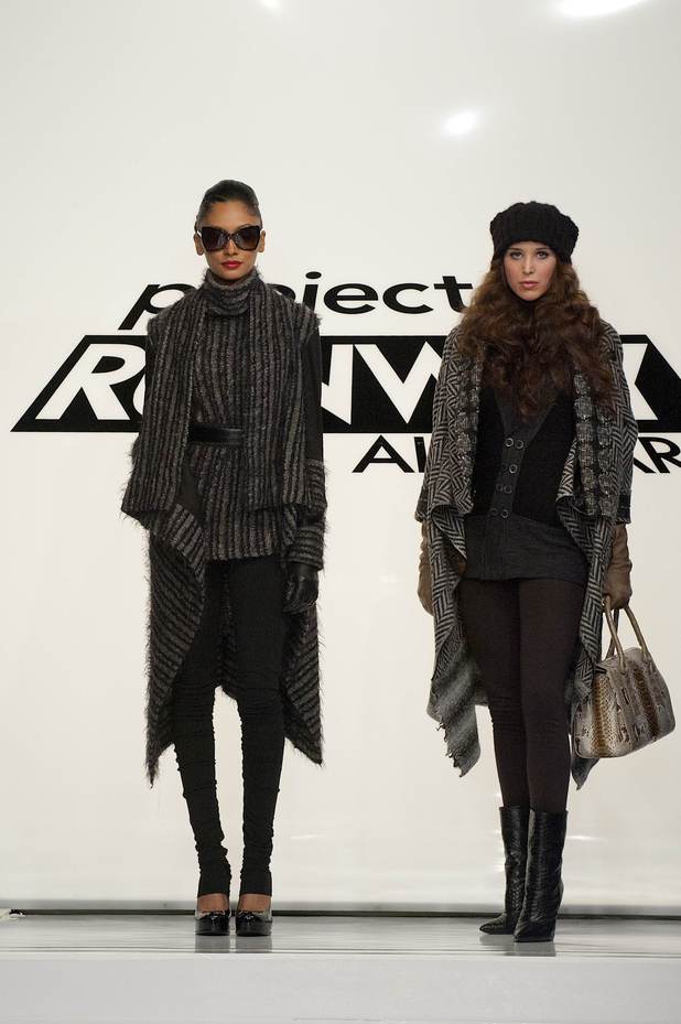
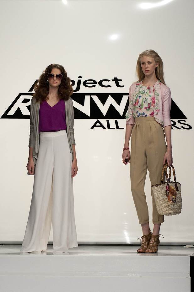
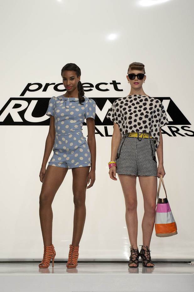
Boy-howdy, the drama for the Fashion Face Off challenge! They did this challenge during the last regular season and I hoped it would be back. Two designers were assigned to one season (winter, spring, summer, fall) and were in direct competition with each other. Each season had one winner who was in the running for winning the entire challenge, and the other was in danger of going home. Of course this type of pressure will bring out some drama.

Winter was chosen by Michael and Jerell.
Michael's left; Jerell's right.
There were thoughts and accusations that Michael plagiarized Jerell's design. While Jarell's and Michael's designs do have silhouette similarities, they do not look designed for the same customer. Furthermore, they bought their fabrics independently, so the similar color palette is coincidence, and, let's be honest, a common palette for winter. So everyone calm the eff down

The truth is that this is the best design I have seen from Jerell and my favorite from the challenge. (I feel sheepish saying that, but I'm guessing it's probably one of those exception-proves-the-rule things?) I love the giant herringbone fabric and that he used at least three different fabric patterns in the coat. And I always like a retro-inspired cardigan. He won the face off and the entire challenge.

Spring was chosen by Kara and Austin.
Kara's left; Austin's right.
I found Austin's outfit to be a bit frightening and not fondly reminiscent of Molly Ringwald in Pretty in Pink. The judges oohed and aahed over the pants, but I just don't feel right about pleated pants. They're dandy for a rail-thin model, but an odd and unflattering choice of most women. Also, the model's hair was horrific. Austin was very close to going home on this challenge

Kara's outfit won the face off. Unlike Isaac I actually liked the color combination well enough and found nothing offensive about the outfit. She was going for a Miami look, and it looks like a subdued Miami to me, but Miami nonetheless. (Side note: Don't you love that "nonetheless" is one word? It pleases me so.)

Summer was chosen by Mondo and Kenley:
Kenley's left; Mondo's right.
They judges really hated Mondo's outfit, but I'm not really sure why the criticism was so intense. Those shorts with the yellow belt were adorable and perfect in construction. (Ms. Rowley have different ideas about Mondo's shorts, but I respectfully call her out as a fashion charlatan.) Sure, the top wasn't his best, and the styling was a little heavy handed, but there was nothing terrible about it.

What's terrible was Kenley's romper that won in the face off. She always does these patterns and polka dots, but never attempts to match the pattern. (It's not always appropriate to match the pattern, but she should have in at least three challenges so far.) I was glad to hear that the judges know she is a one-trick pony. That gives me hope for her prompt dismissal.

Fall was chosen by Mila and Rami. 
Rami's left, Mila's right.
I was bored by both these designs, but Mila's won the face off. The judges thought Mila's cape looked cheap, and I agree. Additionally the fit of the pant and top looked sloppy on the runway in juxtaposition to the cleaner lines of the cape.

Although I didn't love the shilhouette, the blue of Rami's cardigan with the suede details was lovely; I love a change of texture but not color in the same garment. But his green top was again terribly overwrought and bulky, not to mention his ill fitting pants. I wasn't surprised he went home this week since his past few designs were not pretty.

05 February 2012

Project Runway: All Stars: Clothes Off Your Back

I was horrified by the challenge this week. I am introverted by nature (although not particularly shy), so not only do I fiercely guard my own time and my personal physical and emotional space, but I fiercely respect that same space for others. I don't want to be bothered and wheedled and cajoled by strangers, and neither do I want to invade their time and space by being the wheedler. The mere idea of approaching a stranger and asking for their clothes is mortifying. But I suppose my opinions on the topic are neither here nor there in the context of a reality show that I am not a contestant on.

False: My opinions are always relevant to everyone. Always.

Moving on.

As soon as I saw Jarell's final design, I was hoping and "please bless-ing" that he would get the axe this week. As you may know, I don't enjoy his aesthetic, and this week was no different. The thing is, I actually liked much of his pattern mixing, it was the proportions and shapes in the silhouette that were bothersome. There was so much midsection bared, and those gathered halter tops always look one move away from a wardrobe malfunction. (Said malfunction would of course be accompanied by this sound effect: bloop.)


However, the judges were right in sending Anthony home. He ignored the point of the challenge to use a street muse's clothing to create another look inspired by said street muse. Instead he created an outfit for his usual client. Plus his outfit was dated and boring.

I'll be blunt, I loathed, loathed, Rami's outfit. I was surprised he was in the top. It looks so cheap in fabrication and dated by the nothing special vest and polyester 70s color scheme. I just...I can't...that is all.

I was equally surprised that one of the girls wasn't in the top three. I had problems with each of their outfits, but they all seemed more thoughtful and reasonable based on their muses than, say, Rami's or Austin's 80s new wave revival.

Kara's asymmetrical top looked well-made and in good proportion with the high waisted pants. The vest was her misstep.

Very few women could wear a knit dress cut like Kenley's without miscellaneous bulges and jiggles being a problem. Additionally how she divvied and placed each pattern was problematic and awkward, but the general color and pattern mixing were awfully fun and forward.

Mila's outfit was also plagued by a weird winged vest that dated the outfit. She also had odd crotch pieces on the pants. Otherwise she translated her geometric sensibilities into the youngest and most forward pieced I've seen from her. As always, I love when soft or feminine is paired with hard or masculine, and Mila does it well here. I like it the more I look at it (sans vest).

Let's face it, Michael dodged a bullet this week with his mess of an outfit. He wasn't inspired by the challenge, which happens, but he didn't even construct his garment with care and attention. He's lucky that the judges felt that Anthony was even less inspired.

And finally Mondo won a challenge! I won't say that it's my favorite outfit I've seen from him, but he did say he was going for "Japanese street wear," which he surely accomplished. I loved how he worked out the pattern on the shorts. I didn't like that he gave his model a purse; she looked like she'd never carried a purse before. Awkward.