This week the designers were broken into teams of two to design a red carpet look and a stage look for country music star Miranda Lambert. The designers were advised to celebrate Miranda's curves and to make sure that their designs were chic, young, fresh, and easy.
My absolute favorite look was the red carpet look from Benjamin, and I was sorely disappointed that he didn't win. The fit of the dress and the craftsmanship were impeccable--I barely have the words to do the dress justice. The foundation, which you don't even see, is really what makes the dress perfection and is a testament to his craft. The gown was elegant and classic, but at the same time fresh with just enough details to make the look pop. Plus, the color, amazing. Good on ya, Benjamin, for finally getting it together. Now lets hope he can stay together. (This picture does not do the dress justice.)
And his teammate, Amanda, also got it together this week after being lambasted by her teammates. Granted, this challenge was 100% in her wheelhouse, but at least now we know she is what she says she is. Some designers claim to excel in an area, then when they get the opportunity to excel, they bomb. Amanda's dress was great for stage with all the movement of the fringe. However, a slightly lighter color or maybe a little crystal on the ends of some of the fringe, would have made it stand out even more. (I'm not a fan of sparkle, but it makes a huge difference on stage. Like, for real.)
Team Richard and Stanley were the winning team, with Richard coming out on top as the winner with his take on fringe. Richard's dress will look amazing on stage, and that dude works well under pressure, but I was still slightly disappointed with his win. I can't even tell you exactly why. Maybe it's because he kept saying "It is everything" about his design.
Stanley's dress was more of a great idea then a great design. His hammered paillette belt was beautiful in shape and placement, but for the rest of the dress it was obvious that he didn't think enough about who he was designing for, nor was his craftsmanship of the bodice at his usual level. The main fabric was also a little lack luster and doesn't look expensive.
I don't even really want to talk about the bottom designs. I mean, first of all, both Daniel and Michelle put denim in their red carpet looks. DENIM. I don't care what world you are from, there is a one in a billion chance that a designer could even come close to making denim work on a formal red carpet. And I am emboldened to say that no one in the history of ever will make a long denim skirt chic, not even in a casual look. They are always, always a bad idea. Then Michelle put that finge necklace over her look that covered up any work she did on the vest. I actually didn't think the necklace was terrible per se, but it certainly was terrible with that outfit. I really like both Michelle and Daniel, so their designs were especially disappointing. Zac may have had it right when he said Daniel "might be amazing, but he might not be cool."
Samantha was extremely lucky in her immunity. Her look was boring and her construction was barely passable. So that meant that poor, sad Matt went home. I felt really sorry for him, because it's hard to get out from under the weight of self-doubt, especially when everyone around you is moving forward. But designers cannot stay based on their emotional state.
Lastly, special dishonerable mentions to Kate and Patricia. I don't think Kate's idea was the worst, but the color and fabrication mix may have been the worst. The dress fit well and was in good proportion, but the red leather with a different red chiffon looked classless and like a "sexy" 90s vampire. The model just needed black lipstick.
There was nothing redeemable about Patricia's look. The underdress fabric was horrific, and no amount of "gun belt finge" will change that. The only reason she wasn't in the bottom was that Layana's scores pulled them through. I'm ready for Patricia to go home now.
28 February 2013
25 February 2013
Red Carpet Review: Academy Awards 2013
There are only two things I will say about the hosting and show in general: there were segments that seemed to stretch out for eternity, and why can't Tina and Amy host everything, because MacFarlane was lame. Moving on.
I've been seeing and saying this for a while, but the 20s are and will be strongly referenced in fashion this year, and the Oscars certainly showed that. It's not the straight-up flapper references that you might expect, but instead Art Deco becomes the star. There was plenty of beading and column dresses to help stars look like charming versions of the Chrysler building.
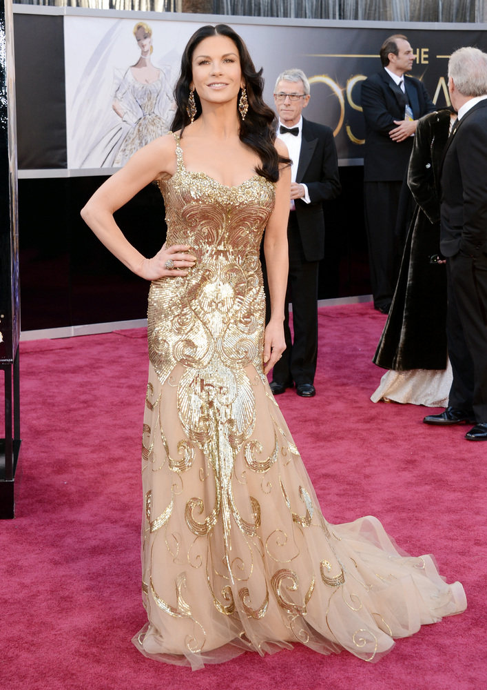
Jessica Chastain and Catherine Zeta Jones were both in Deco beaded gold, but each having different success. Chastian's is subtle and lovely, and while Jones's beading was neat, it was not the best silhouette for her body.
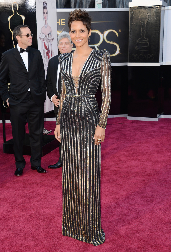
Halle Berry's Deco dress was the most architecture-like. I love the minimal structured shoulder that has been more popular in recent years. It's strong without being 80s big or overly masculine.
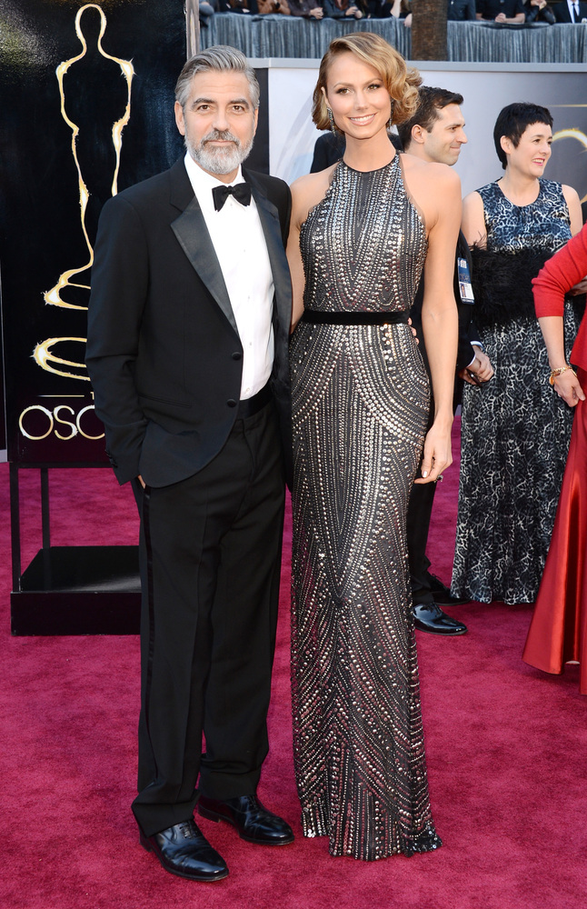
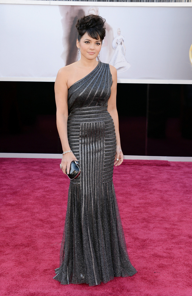
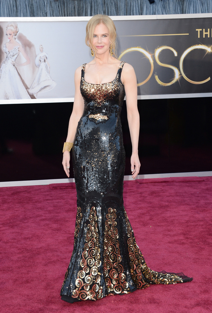
Other Deco dresses included Stacy Keebler and Michelle Obama, and Nora Jones' and Nicole Kidman's dresses showed small winks to Deco.
Worst!
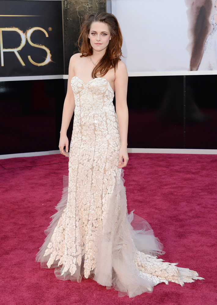
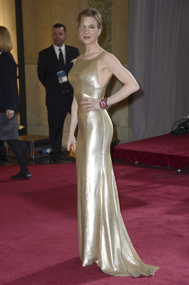
I didn't consider any dresses in my deliberations from red carpet interviewers or other stars who are always poorly dressed, bless their hearts. Aside from the usual suspects, my bottom three are Anne Hathaway, Kristen Stewart, and Renee Zellweger.
I know, Stewart should probably be one of the usual suspects, but she just looked so sloppy, from hair to dress to posture, that I couldn't not put her on the list. The fit is terrible and the dress looks like it's sliding down her body. Plus she cleared her throat into the microphone at least twice while she was presenting. Ew.
Renee Zellweger looked sloppy too. The color was wrong for her and the silhouette did nothing for her figure. She looked like she felt really uncomfortable.
My boo-iest boo goes to Anne Hathaway. I have to admit that the dress looks passable in this picture, but it was worse when she moved in it. It looked like student work to me with the odd fit, that tortured looking fabric, and eight different straps in the back, and I'm always disappointed when dresses don't have or don't facilitate bust support. However, I loved her necklace.
Dishonorable mention!
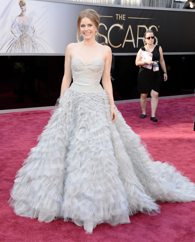
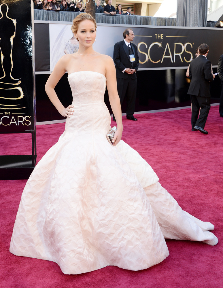
I have to mention both Jennifer Lawrence's and Amy Adams' dresses. While they both had lovely elements, they were simply too much dress. The ladies looked uncomfortable and cumbersome when they moved, and I can't even imagine trying to sit in a theatre seat for four hours with that much fabric to contend with.
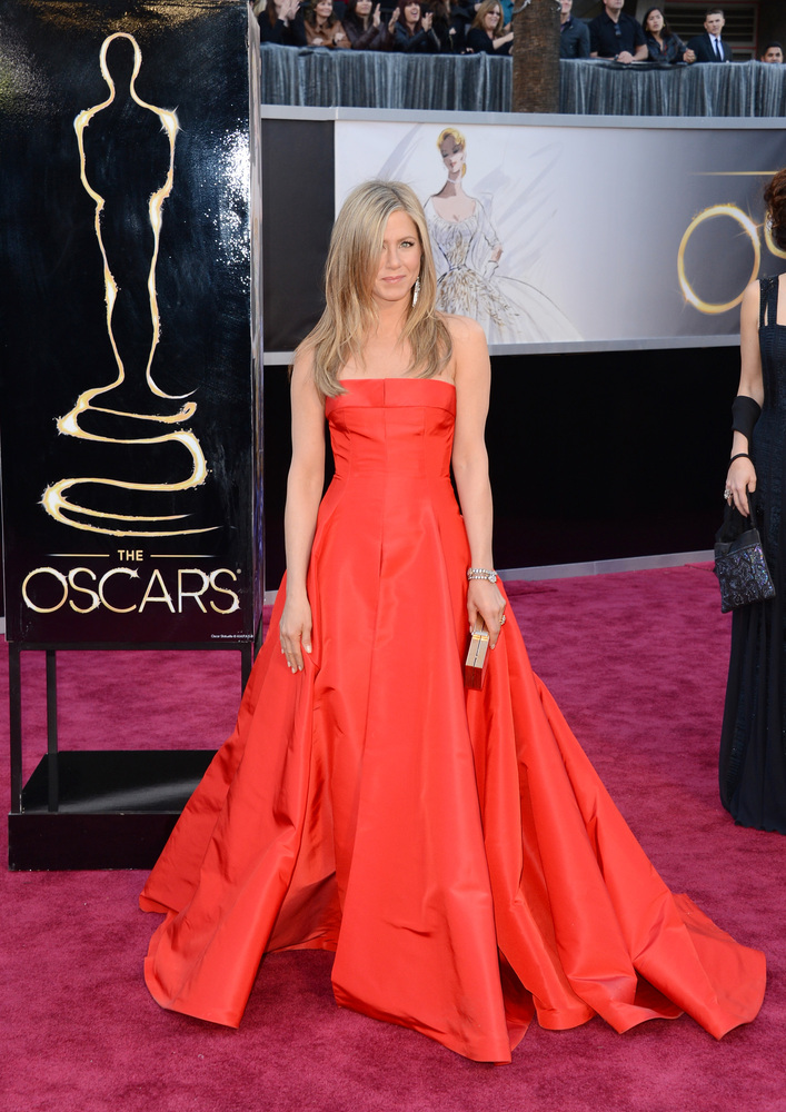
Speaking of volume, Jennifer Aniston's dress had a better proportion of volume, and she looked lovely in that perfect red.
Best!
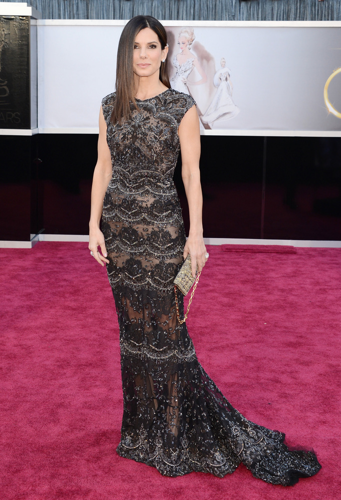
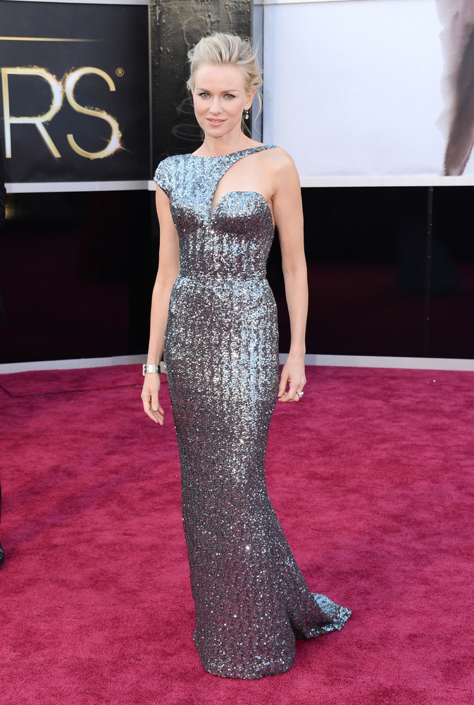
I wrote down a lot of dresses that were good to great, but nothing was a stand out for me. I suppose my four favorites were Jessica Chastain (pictured above), Sandra Bullock, Charlize Theron, and Naomi Watts. (Yes, Naomi Watts.)
I have been loving designer Elie Saab lately, and Bullock wore it well. Lace is rather a tricky medium, because it can quickly turn old fashioned and dowdy, but Saab has the magic touch.
I just love that Theron's dress is dramatic with exceptionally clean structure and lines. I could've done without the vee in the front, but it didn't ruin the look.
I will get flack for this, but I applaud Watts' dress. It was different from anything on the red carpet, it had those clean lines and asymmetry that I love, and it was a nice balance of classic with something unexpected. Not just anyone could've worn this dress, but Watts pulled it off in my book.
Honorable Mentions!
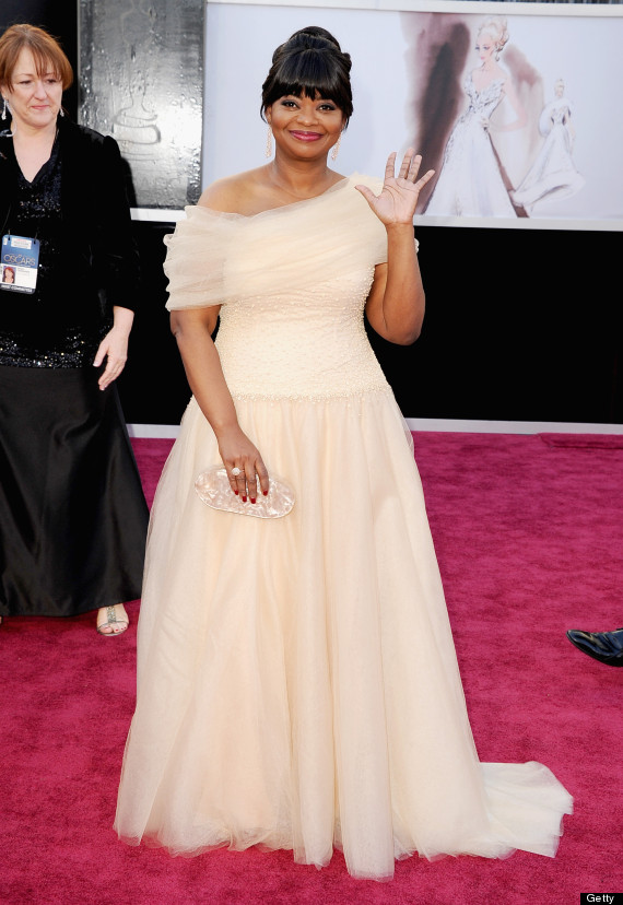
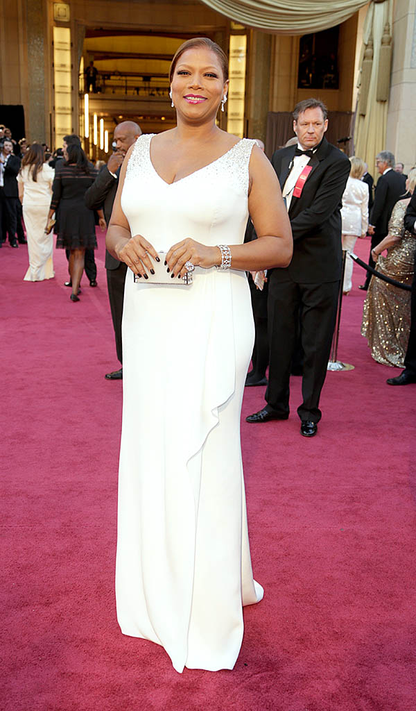
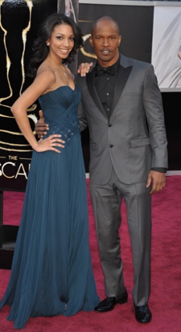
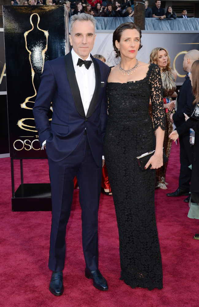
In no particular order, all of these ladies looked lovely. Octavia Spencer, Kerry Washington, Queen Latifa, Jamie Foxx's daughter in dark teal, and Daniel Day Lewis' wife.
I've been seeing and saying this for a while, but the 20s are and will be strongly referenced in fashion this year, and the Oscars certainly showed that. It's not the straight-up flapper references that you might expect, but instead Art Deco becomes the star. There was plenty of beading and column dresses to help stars look like charming versions of the Chrysler building.
Jessica Chastain and Catherine Zeta Jones were both in Deco beaded gold, but each having different success. Chastian's is subtle and lovely, and while Jones's beading was neat, it was not the best silhouette for her body.
Halle Berry's Deco dress was the most architecture-like. I love the minimal structured shoulder that has been more popular in recent years. It's strong without being 80s big or overly masculine.
Other Deco dresses included Stacy Keebler and Michelle Obama, and Nora Jones' and Nicole Kidman's dresses showed small winks to Deco.
Worst!
I didn't consider any dresses in my deliberations from red carpet interviewers or other stars who are always poorly dressed, bless their hearts. Aside from the usual suspects, my bottom three are Anne Hathaway, Kristen Stewart, and Renee Zellweger.
I know, Stewart should probably be one of the usual suspects, but she just looked so sloppy, from hair to dress to posture, that I couldn't not put her on the list. The fit is terrible and the dress looks like it's sliding down her body. Plus she cleared her throat into the microphone at least twice while she was presenting. Ew.
Renee Zellweger looked sloppy too. The color was wrong for her and the silhouette did nothing for her figure. She looked like she felt really uncomfortable.
Dishonorable mention!
I have to mention both Jennifer Lawrence's and Amy Adams' dresses. While they both had lovely elements, they were simply too much dress. The ladies looked uncomfortable and cumbersome when they moved, and I can't even imagine trying to sit in a theatre seat for four hours with that much fabric to contend with.
Speaking of volume, Jennifer Aniston's dress had a better proportion of volume, and she looked lovely in that perfect red.
Best!
I wrote down a lot of dresses that were good to great, but nothing was a stand out for me. I suppose my four favorites were Jessica Chastain (pictured above), Sandra Bullock, Charlize Theron, and Naomi Watts. (Yes, Naomi Watts.)
I have been loving designer Elie Saab lately, and Bullock wore it well. Lace is rather a tricky medium, because it can quickly turn old fashioned and dowdy, but Saab has the magic touch.
I just love that Theron's dress is dramatic with exceptionally clean structure and lines. I could've done without the vee in the front, but it didn't ruin the look.
I will get flack for this, but I applaud Watts' dress. It was different from anything on the red carpet, it had those clean lines and asymmetry that I love, and it was a nice balance of classic with something unexpected. Not just anyone could've worn this dress, but Watts pulled it off in my book.
Honorable Mentions!
In no particular order, all of these ladies looked lovely. Octavia Spencer, Kerry Washington, Queen Latifa, Jamie Foxx's daughter in dark teal, and Daniel Day Lewis' wife.
19 February 2013
Project Runway Teams: "The Ultimate Hard and Soft"
Welcome to the obligatory unconventional challenge. Sometimes these challenges produce amazing beauty and innovation, and sometimes they produce horror and gore. The beauty produced this time around was a bit overwhelming in awesomeness.
Each team had to make a cohesive line of six looks with items from a hardware store and a floral shop. As predicted, the teams also had a shakeup and were rebalanced. Stanley and Layana landed on Dream Team, and Michele was scooched over to Keeping It Real. Stanley really took charge of KIR; he dictated a theme of vintage Dior and a pastel color palette, and everyone fell in line and got it done. (Stanley's decisiveness and big picture mindedness might put him in the final three.) Meanwhile DT had no theme and it took a toll on their cohesion, meaning their line was not cohesive.
The judges decided not to pick a "losing" team, because both teams did well, which was a joke since someone still had to go home from the "second place" team, KIR. But it is true that both teams did really well.
DT's Dior theme really paid off for them. It was smart to create classic, familiar silhouettes with unconventional materials. Despite all the talk of creativity and thinking outside the box, the truth is that most people really want at least one familiar aspect involved. I believe it makes people feel safe and grounded in a small way.
Samantha won the challenge, but she didn't made it into my top three. The funny thing is that when she started struggling with her original design I thought, "She should just finish the top and make a simple pencil skirt to finish the outfit," which is exactly what she did. I really loved the look of the layered leaves under the skirt, but the hem should have been a baby hem (if possible), or at least no more than an inch. The overall silhouette was particularly lovely, but I didn't see anything particularly special about the bodice mix of materials. Nothing was bad, it simply wasn't for me.
The way Layana communicates with other people rubs me the wrong way. (We all know those people that seem sugary sweet, then one day you realize that they're just saying foul things with a sweet voice and out of a sweet face.) But the twig cage she built really was beautiful. The colors, silhouette, and proportions were all spot on, and the details were surprising and beautiful.The overlap of the textures on the bodice was particularly inspired.
Stanley's dress was meticulous without being fussy. Every piece of flora was placed carefully, thoughtfully, and in great proportion (even though my tastes call for the skirt to be a few inches shorter). Bonus, it also looks comfortable.
And I'm surprising myself by putting Matthew in my top three. That rope and mop bodice was structurally hard yet feminine. I can't say I'm crazy about the skirt shape, but somehow it all works in a pleasing manner.
KIR's too-little-too-late theme of "decades" didn't help them convince the judges that they had cohesion, but the effort had to be made. Nothing from KIR was crazy good, but they held up well enough.
Boy did the whole team throw Amanda under the bus. I mean, I'm sure Amanda's problems in the workroom were edited to be as dramatic as possible, and I didn't think it was dramatic at all, nor was she a burden on the other team members. Yes, she fairly could have gone home, because her dress was not super great, but it wasn't any worse than Joe's or Patricia's. I don't think Amanda will make it to the top, but maybe this kerfuffle will light a fire under her bum.
I didn't care for Kate's dress. Whatever treatment is happening at the hem is really distracting, as is the shape of the skirt made with chicken wire. I was also bored with her application of the unconventional materials. None of it was special or particularly well done.
I don't get Patricia. I just don't.
Joe went home for his pseudo sweater dress idea. It wasn't awful, but it wasn't great, and someone had to go home. Often the fey, alternative perspective contestants are yet another scape goat for judges. I mean, the producers want the various design perspectives to make a more layered show, but the judges generally go for at least some adherence to the conventions of the "now" in the fashion world. Such is life.
Michelle and Richard's dress deserves a positive mention as well. Talk about a nice balance of hard and soft. It was a cool idea to have the greenery sort of pushing out of this cage-like dress (even though I'm not overly fond of the S&M look of the cage). They could have pushed the concept a little more, and I would've liked to see flowers in the midriff too.
P.S. Surprised I didn't say something about Daniel's hip bumps? Yes, they were kind of weird, but they were kind of interesting, and his construction was flawless. Plus those lambs ears are perfect.
13 February 2013
Trailer Tuesday: Mental & Jack the Giant Slayer
Toni Collette back with creators of Murial's Wedding? I'm in. No more need be said except "I am the avenging angel of the perpetually humiliated."
Now, Jack the Giant Slayer isn't a movie that I'd normally clamber see, and the quality of the CGI giants already bothers me, but Ewan McGregor could persuade me to watch almost anything. Plus I rather like Nicholas Hoult (About a Boy, Warm Bodies), and Stanley Tucci (Easy A, The Lovely Bones) is a highly underrated actor.
12 February 2013
Project Runway Teams: Surprise Me
Last week was the Heidi challenge. First of all, everyone kept saying "it's easy to dress Heidi because she is a model." Lies. It may be easier to understand the fit work out the proportions for a model's body beforehand, and that's about it. And the designers are not just "dressing a model" in whatever they want; this challenge is very specific in purpose, and Heidi is self-admittedly picky.
Okay, so the assignment was for each team to design 6 looks that Heidi could wear in promotion of her new fragrance, Surprise. The breakdown was 4 looks as options for the ad campaign and 2 looks as options for a red carpet press event. The designers were also restricted to using pink, gold, and black in their designs.
Team Keeping It Real wins yet again, which makes me think that they will shake up the teams next week to re-even things out. It's funny because Keeping It Real don't seem to help each other more, but they seem to be more emotionally stable as a whole. That might be taking it too far, but it feels generally true within the editing.
Since there were two events for Heidi, there were two winners.
Daniel designed for the ad, but he won for the press event. I adore Daniel. I'm not always 100% on board with his designs, but he has obvious skill and great follow through. Plus he's a sweetheart. The dress is nothing new or special, except for what he did with the leather trim. I'm not even sure how he did it, but it looks like it's floating over the dress. And the edges are nice and rounded, but the two layers move as one.
Kate won (with Layana as her partner) for the ad. I was surprised how will their dress turned out. It's not something I would design, but they really did a good job of mixing the hard and soft. (Even though Layana did whatever she could to demoralize Kate in the workroom, and all with a smile on her face.) The bodice front is especially nice with the draped overlay. However the lacing on the back bodice went a little in the direction of...Rocky Horror Picture Show. I don't think Kate will last until the final episode due to lack of experience, and I hope Layana doesn't make it because I fear she might be a jerk behind that pretty face.
Everyone else on the team just did okay--nothing special. Except for Patricia. The judges were loving her dress, eating it with a spoon, but I absolutely hated it. I actually like the textiles she creates, but I hate how she utilizes them. I thought the dress looked sloppy, frumpy, and drab. I mean, the underdress was made out of cheap fabric that looks manhandled when stitched, and it made the model's bust look odd. I didn't get the mountain of praise at all.
Och, there was not one dress I liked from the Dream Team. I liked the leather yoke on Michelle's dress and that's it. Nothing else was even remotely good.
But the bottom two is where the real disappointment lies. I don't know why PR keeps casting designers over 50. I don't mean to be agist, but that age group simply hasn't performed on the fashion forward level the judges expect. I almost believe that they do it so they can have a scapegoat when needed. I certainly think Cindy was the Out scapegoat, because although her dress was...not good, Benjamin's was certainly worse. In fact I was surprised that Cindy got that taffeta to look as good as she did. It's an extremely difficult fabric to handle without puckering at the seams and hems.
I've liked Benjamin from the beginning, and I think he has it in him to do better work, but I'm absolutely shocked that he didn't go home. He should have. What he sent down the runway was basically garbage, and I think that's putting it kindly. Fit, proportion, fabric choice, and construction were all terrible. I don't even think the idea was as great as some of the designers said. But, I will wait and hope for renewed vigor and vim from Benjamin, and maybe he can still shine.
P.S. I want gobble up Zac Posen, or at least caress his eyebrows. He's a charmer and a living doll. Also is it just me, or is all the styling this season lackluster?
06 February 2013
Trailer Tuesday: From Up on Poppy Hill
I simply had to re-debut Trailer Tuesday on a Wednesday, because Studio Ghibli and Hayao Miyazaki and his son Goro are releasing another movie: From Up on Poppy Hill. Ghibli movies are always visually lovely and thoughtful in content, so I'm looking forward to March 15.
01 February 2013
Project Runway Teams: Spin Out
This week's challenge was to design new server and "ball boy" uniforms for Spin, a ping pong social club. (Yes, this is a ridiculous idea for a club, but that's not what I'm here to discuss.)
I was surprisingly inspired by this challenge. I never give any thought to uniforms or sports-like clothes in general, but I still have all these little sketches next to my notes. It's probably because I always want clothes to be practical with little fuss while still looking and feeling amazing. And that is exactly what this challenge was supposed to mean. Sadly I think most people worried about the fashions and not enough about practicality. Practicality and wearability must always take precedence with servers who are on their feet for hours and hours.
Oy, there were some painful designs, and the Dream Team had most of them again. The design I like most from their team was Michelle's. I didn't necessarily see it as "server," but there were some good things happening. The elastic detail in the back was creative, and it ensures coverage with a lot of movement. But the collar was too big for all the bending and moving a server has to do. It would drive me crazy as a server for sure.
The top three were pretty good, but there was still much to be desired. I actually thought Stanley was the most successful. Even though he didn't have enough experience with knit construction to produce a polished piece, the ideas were right. Any server could throw that outfit on and not worry about it while they focus on doing their job.
Daniel and Layana were the winners, but for me the vest was far too fussy with that student work collar. If they did a plain, fitted vest, that outfit would been more win worthy. But the practicality of the skort pulled Layana into the winning slot. As I said, practicality takes precedence.
Joseph and Richard's T-shirt was also thoughtful and great in it's simplicity. I may have toyed with the size and placement of the slogan a little more, but time crunches do not beget perfection.
The worst for me were Amanda, James, and Matthew's kilt.
Really, Amanda? Who wants to bend over in that dress and have their boobs fall out while serving? I mean, being sexy for tips is one thing, boobs in a customer's face is quite another.
Really, Matthew? Not very many men would be caught dead even looking at a kilt. Especially American men. But I need to get something out of my craw. If you choose the slogan "Balls are our business," you have already introduced a theme of vulgarity to your company, so you can't blame the designers for expanding and continuing that theme. That's not to say that the kilt was a good idea, because it wasn't, but get real Susan Sarandon.
And lastly, poor low self-esteem James is Out. He resisted critique and help so much that the changes he did make were begrudging and therefore poor. He needed someone else to blame to make himself feel better. And I'm not trying to be mean, I actually feel a bit sorry for him, and I hope that he can figure himself out. Side note: look at the models face. He looks like a sour-faced villain from a BBC period drama.
Subscribe to:
Comments (Atom)


